


The Type-Face project
_
Beauties of forgotten typefaces
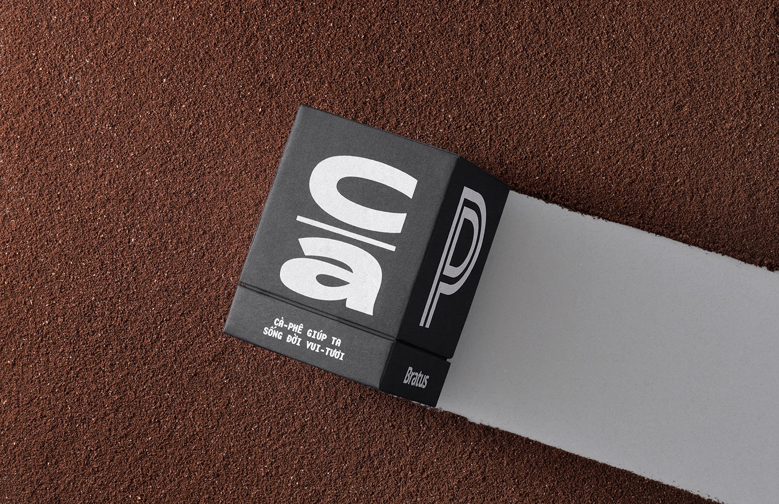
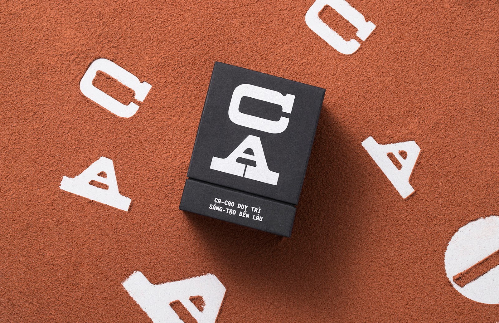
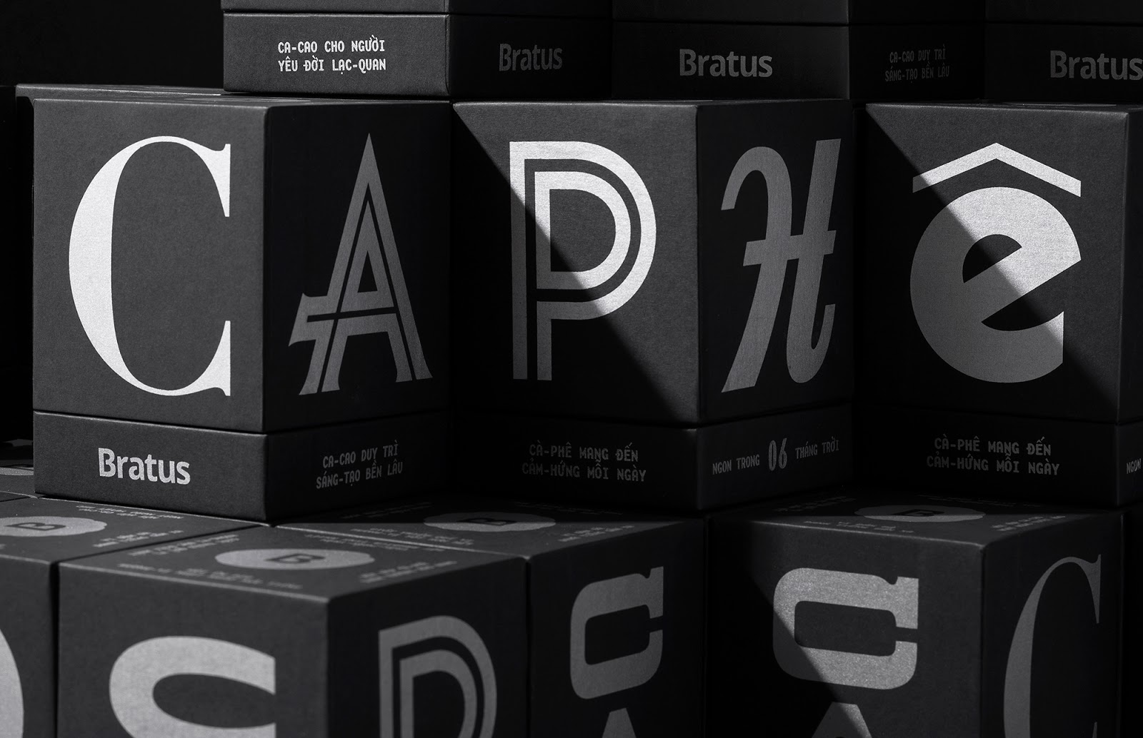
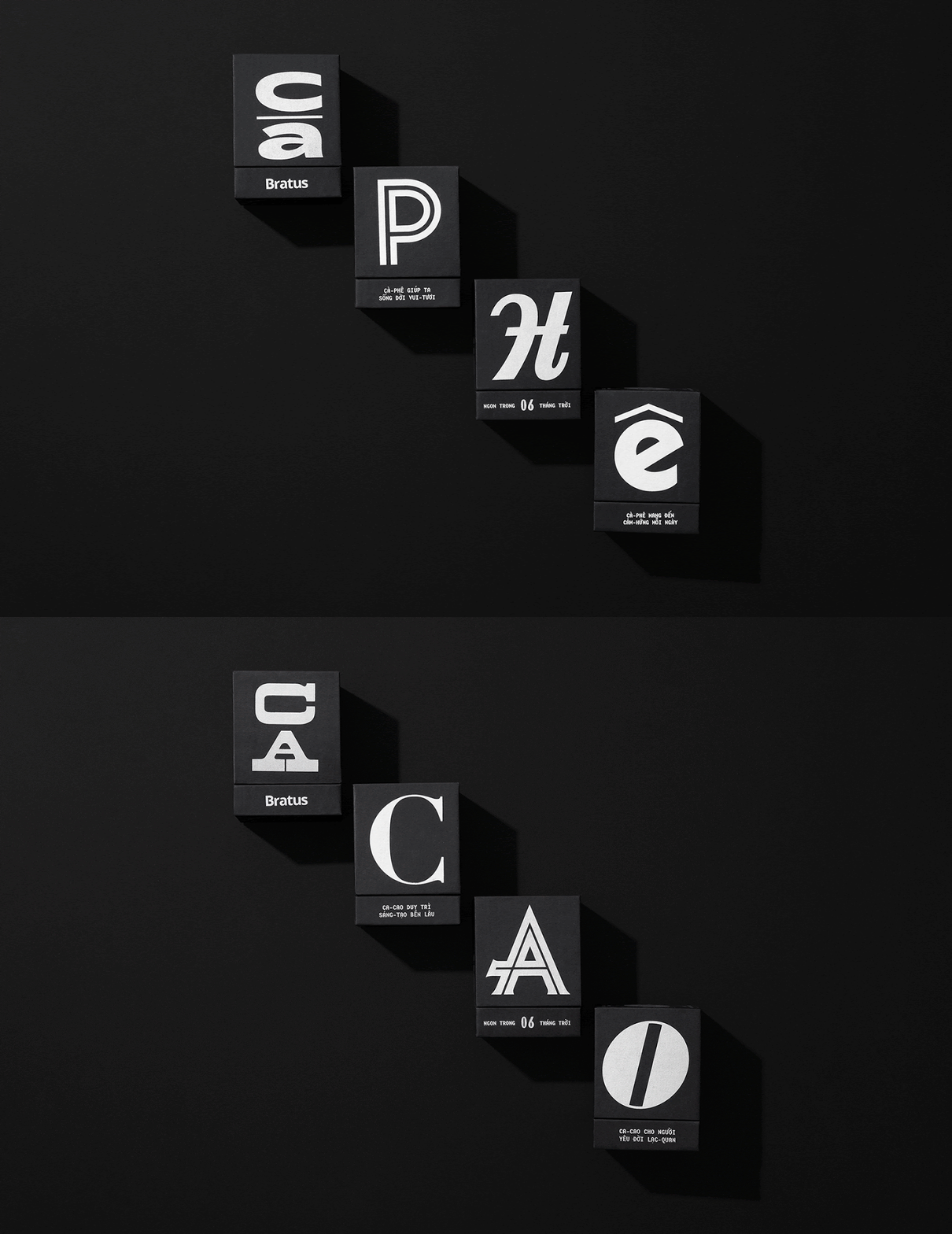
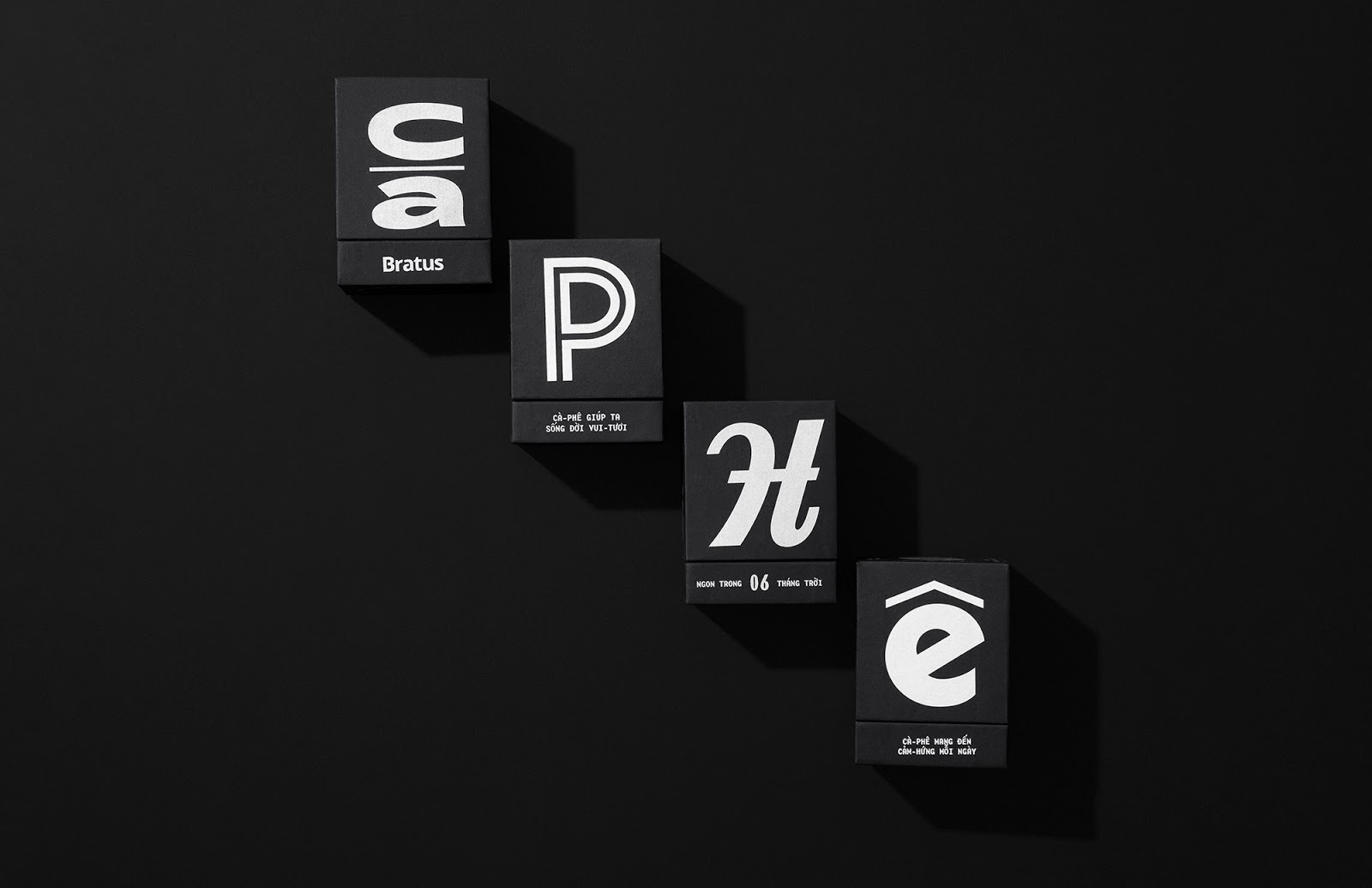
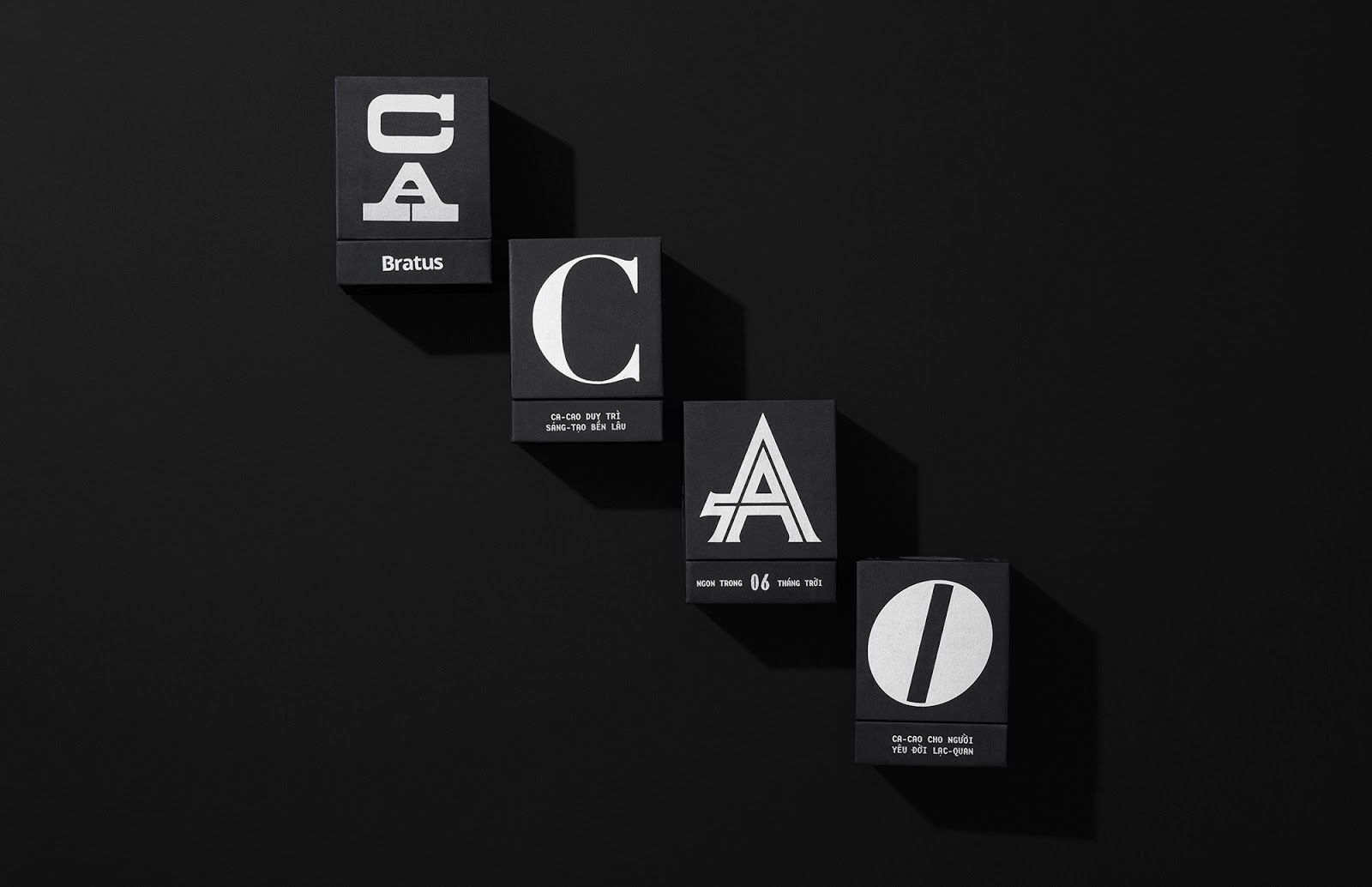
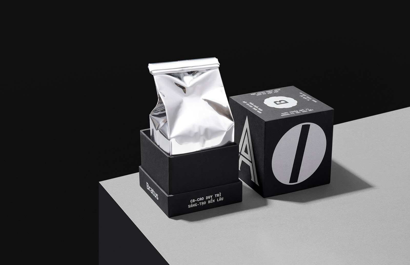
The main purpose of M?t ch? (Type-faces) is to establish a packaging system for coffee and cacao gifts, belonging to Von Viet Project and Bratus. Inspired from the daily coffee and cacao habits in the past, we look back and re-consider the colonial cultural highlights and Indochine design factors in Vietnam’s twentieth century. At the end of the research, I decided to revive the elegance of Vietnamese typefaces in the past – the forgotten cultural heritage.
主要目的是建立一個咖啡和可可豆禮品的包裝系統,屬于Von Viete項目和Bratus。我們從過去的日常咖啡和可可習慣中汲取靈感,回顧并重新思考越南20世紀的殖民文化亮點和印支派設計因素。在研究的最后,我決定恢復越南字體在過去的優雅-被遺忘的文化遺產。

Approaches
“Honoring the interesting characteristics and essences of the antique typefaces”
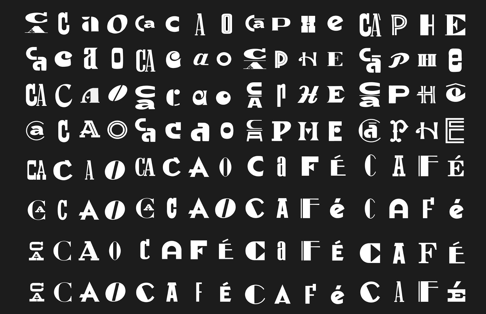
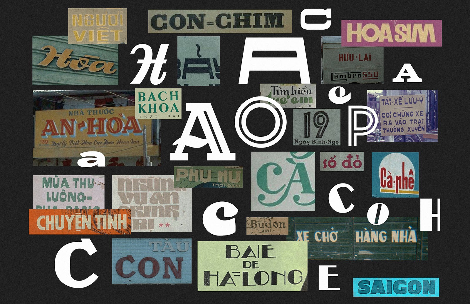
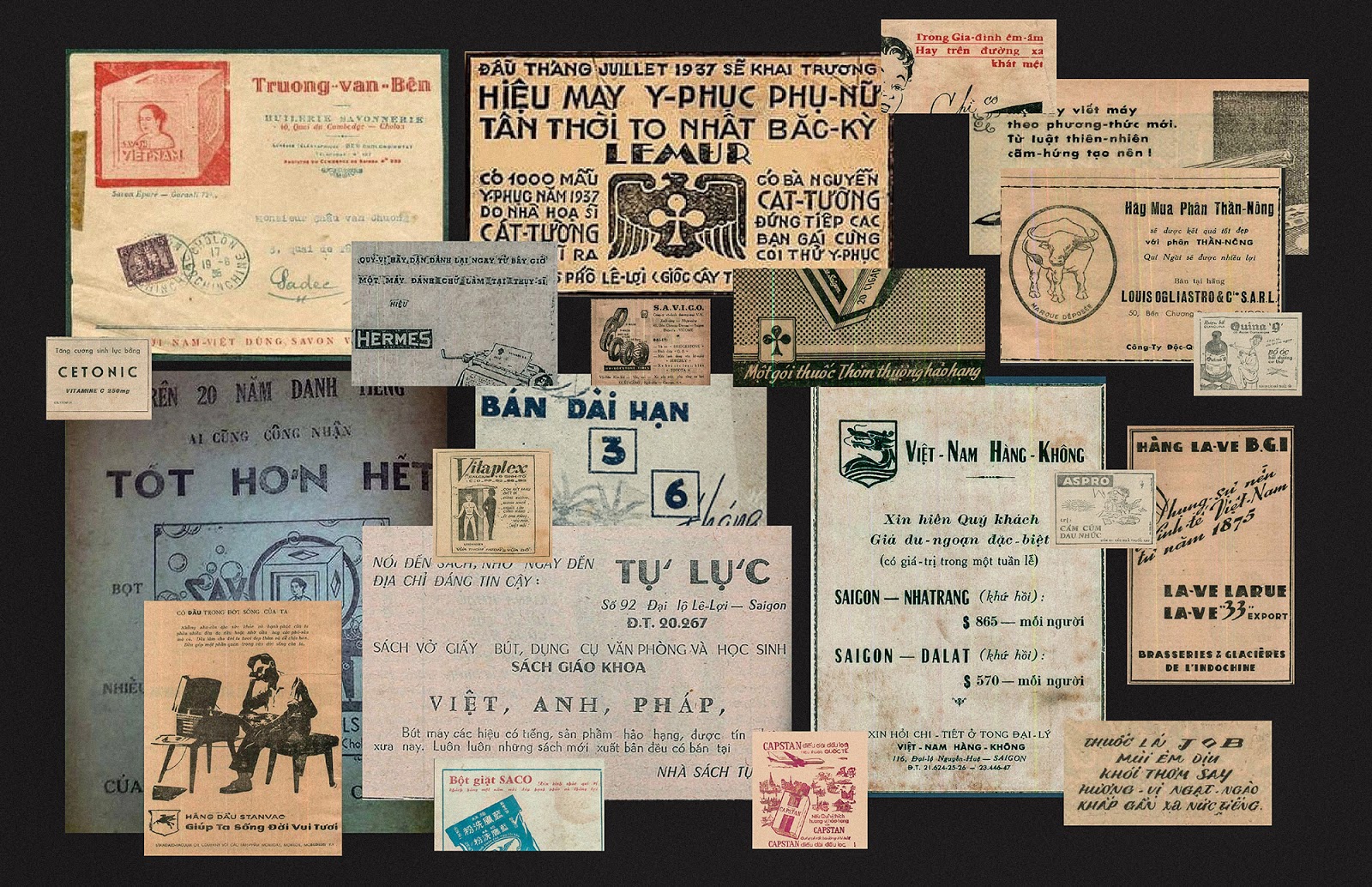
Our design process is the journey back to the past to collect and resurrect the most popular and outstanding typefaces lasting in Saigon before 1975. We were so eager to discover individual letters from the internet, documents, books, magazines, old store banners, and archived resources. This primary research prepares a diverse collection of typefaces, ready for our experiments and exploration.
The Contents
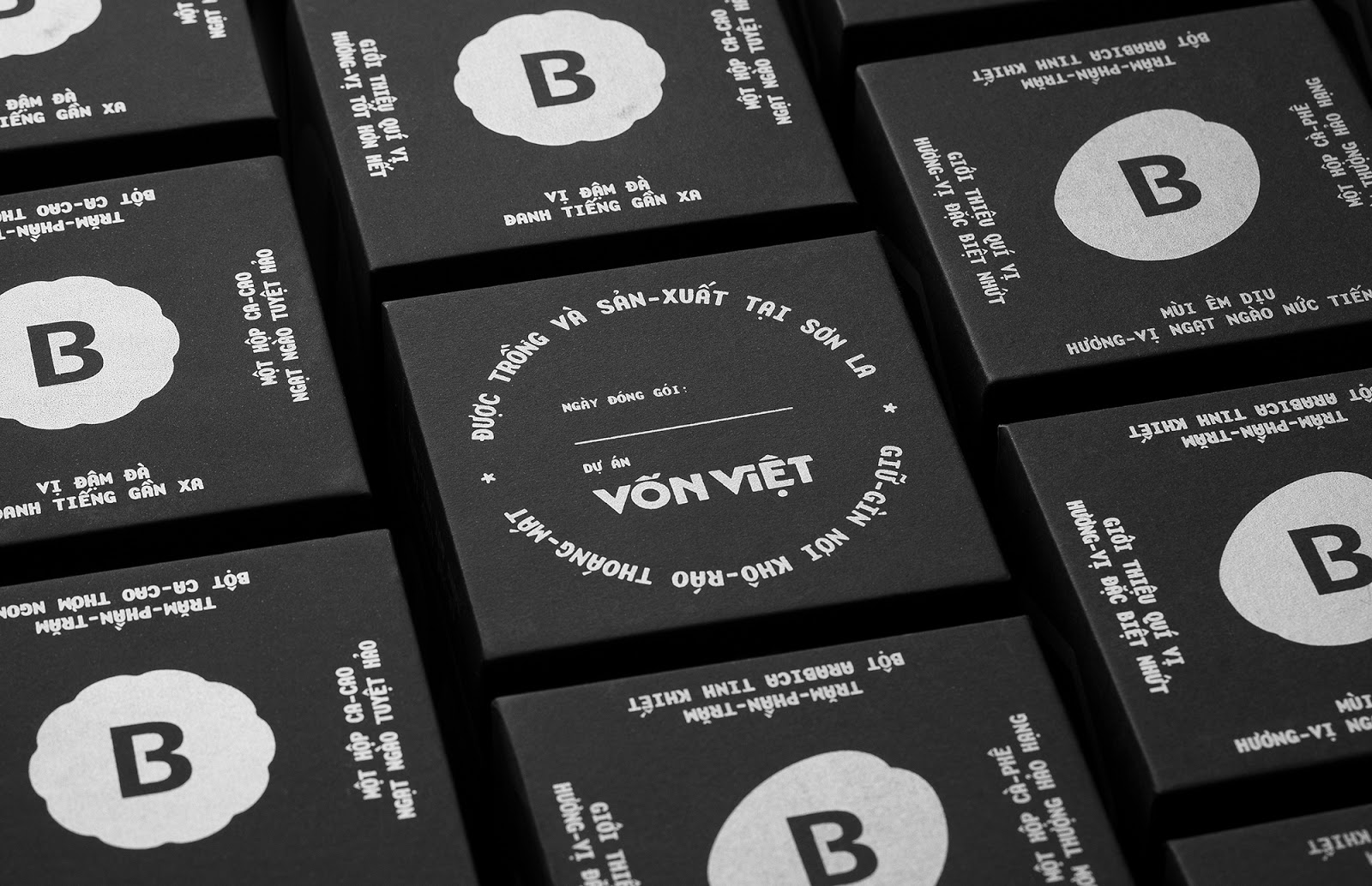
To match the content with a visual concept, we studied how old Saigoneses feature their product on newspaper ads, then drafted up our advertising for the coffee and cacao packagings. The package content required the precise and funny compilation, that’s why we imitated the wordplay and poetic writing, as well as previous Vietnamese vocabulary. As a result, the content delivers a verbal announcement of the products with familiar, rustic, and exciting messages.
Concept Design
“This packaging is a gallery of typefaces”
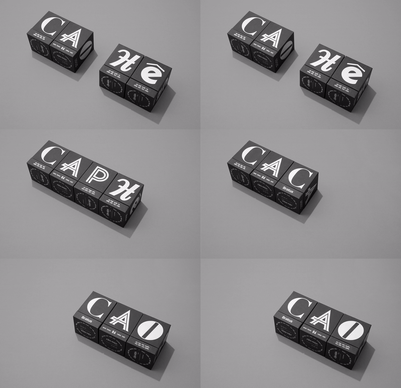
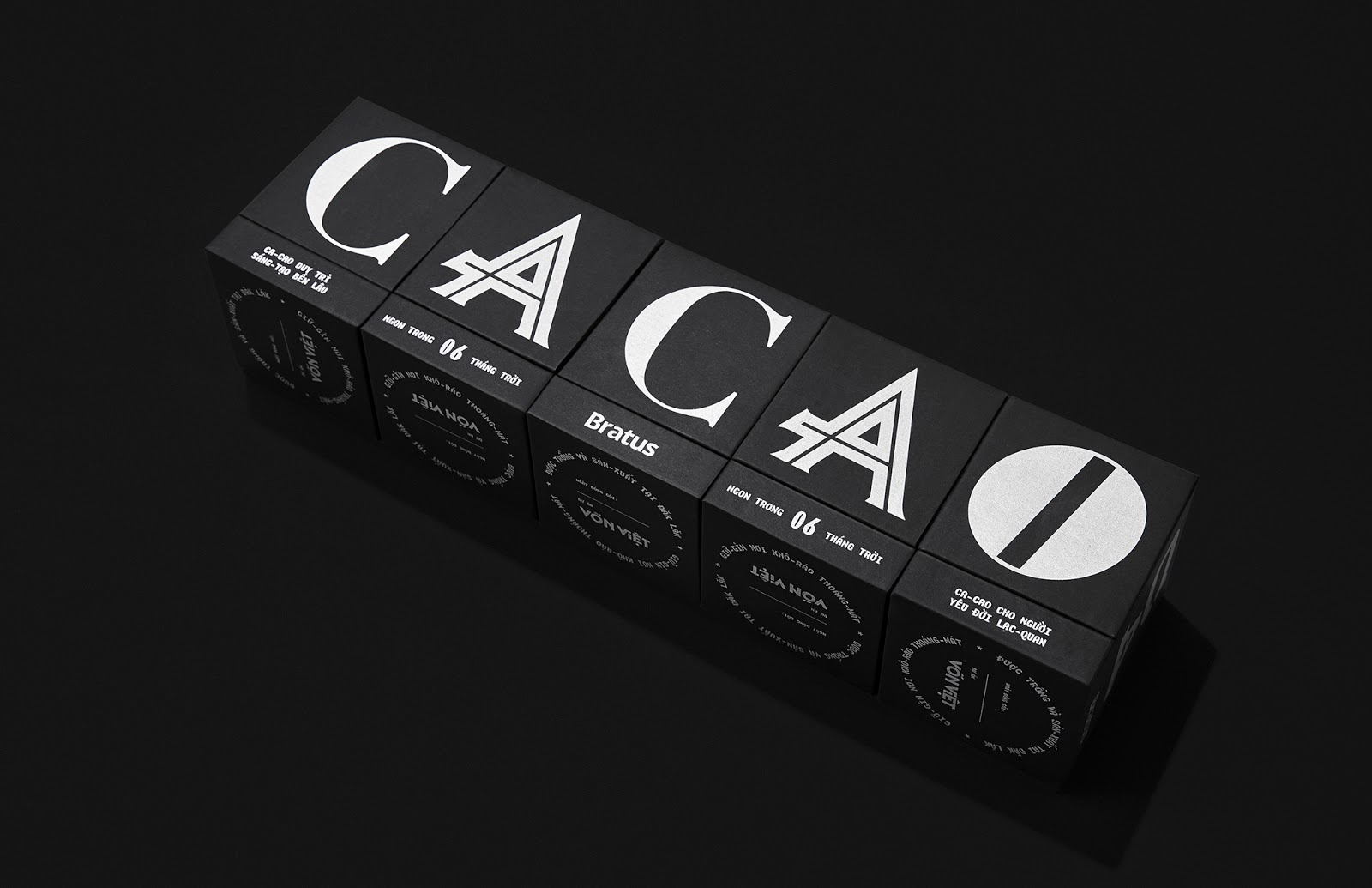
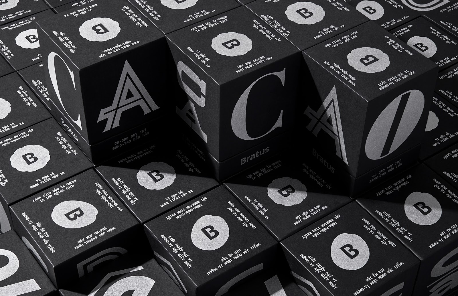
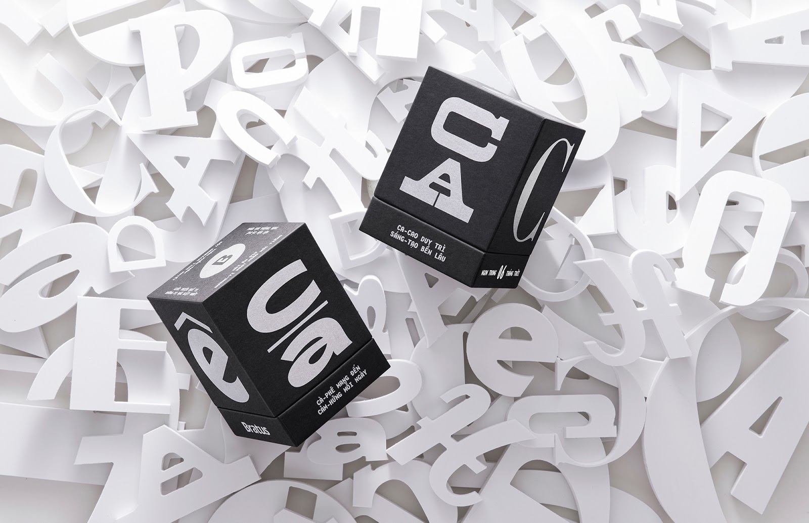
Since we had collected a big precious typeface collection and neither of them was enough to represent the whole era, we determined to recruit all typefaces by selecting random letters from each type and setting them on different faces of the box. That is also the explanation for the project names M?t – Ch? (Type-faces). The final output becomes a multidimensional artwork spreading out the packaging surface and tells its own historic stories.
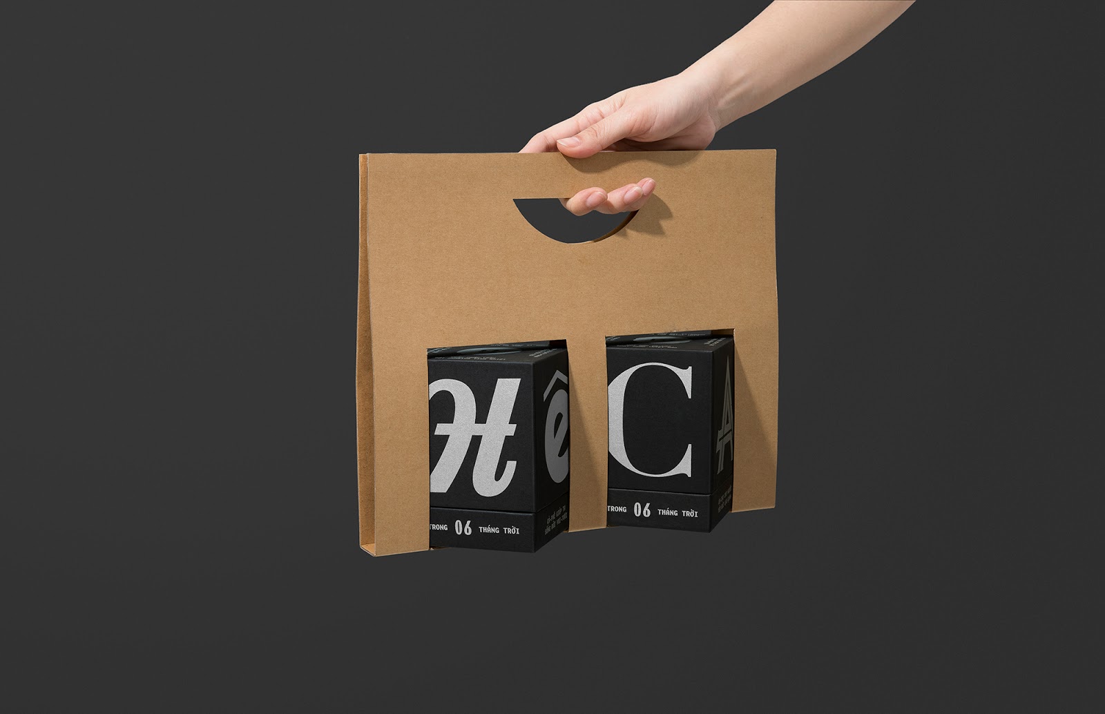
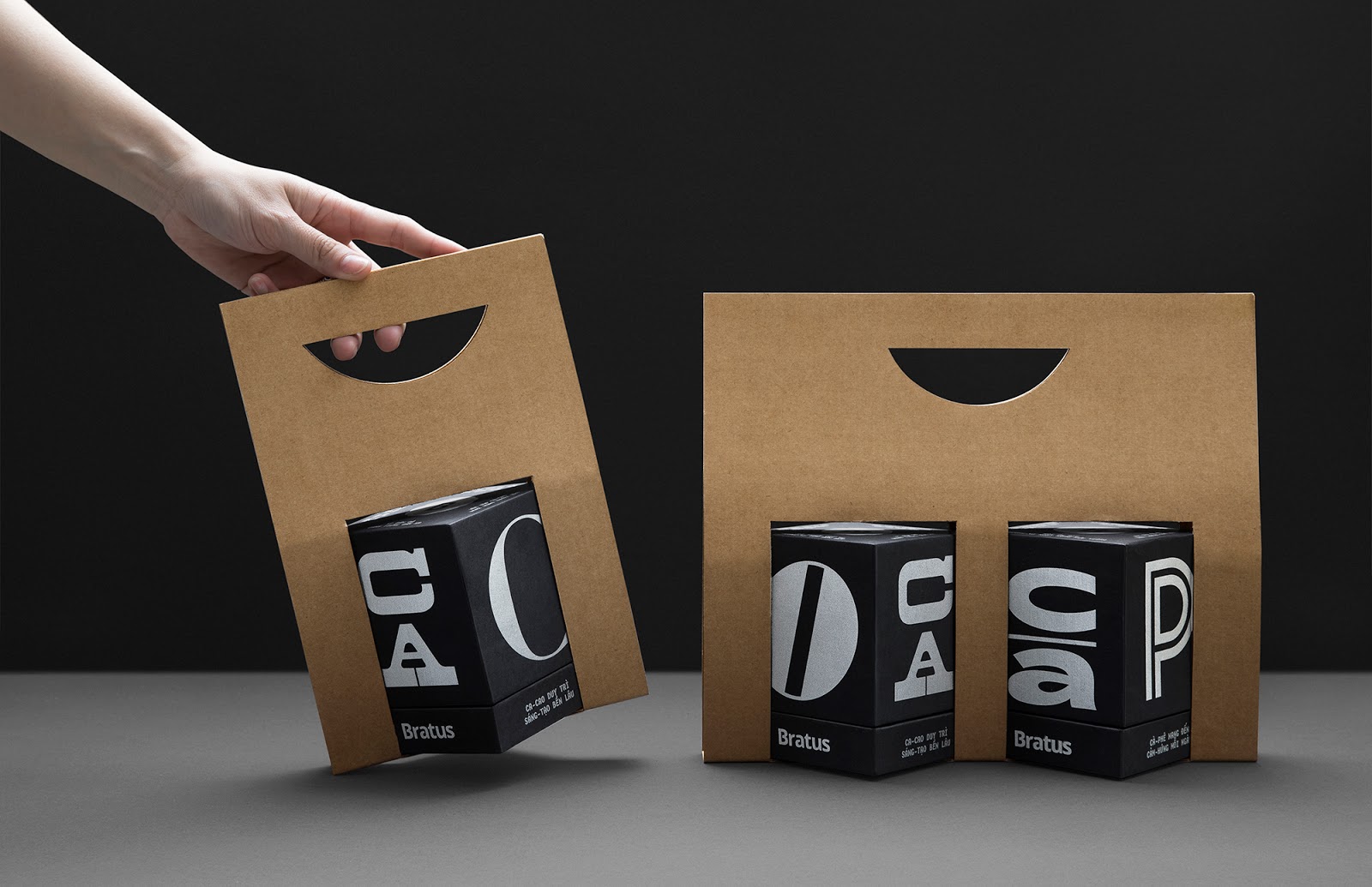
We also invest the silver-foiled silkscreen printing on the quality paper to enhance the result’s experience. To promote convenience and environmental-friendliness, we design an unglued take-away holder with cardboard material. The content of the packaging reflects the verbal language of advertising in old Saigon, with familiar, rustic, and exciting messages.
M?t-ch? (Type-faces) project not only appreciates the eternal aesthetics and diversity of the previous decades’ typefaces, as well as reminds the constant development of Vietnam’s graphic design and the cultural potential for modern packaging.
方法
尊重古董字體有趣的特征和本質。我們的設計過程是回到過去的旅程,以收集和復活1975年之前在西貢流行的最杰出的字體。我們非常渴望從互聯網,文檔,書籍,雜志,舊店標語和檔案中找到個別信件資源。這項主要研究準備了各種各樣的字體,以備我們的實驗和探索之用。“最大的挑戰是要生產出一種與西貢文化接近,但又現代又最小的有趣包裝。”
概念
“此包裝是字體庫”。
由于我們收集了一大筆珍貴的字體,而且它們都不足以代表整個時代,因此,我們決定通過從每種字體中選擇隨機字母并將它們放在盒子的不同面上來招募所有字體。這也是項目名稱M?t-ch? (Type-faces) 的說明。最終的輸出結果變成了在包裝表面上展開的多維藝術品,并講述了自己的歷史故事。
我們還將在優質紙張上進行銀絲網印刷,以增強效果。為了提高便利性和環境友好性,我們設計了一種用紙板材料制成的非膠粘外賣支架。包裝的內容反映了古老的西貢廣告的口頭語言,帶有熟悉,質樸和令人興奮的信息。
M?t-ch? (Type-faces) 項目不僅欣賞了前幾十年的字體的永恒美學和多樣性,還提醒了越南圖形設計的不斷發展以及現代包裝的文化潛力。
標簽:咖啡包裝 可可豆禮品包裝 汲取靈感 印支派設計 被遺忘的文化遺產 重新思考 字體庫 包裝表面 越南圖形設計 Bratus Agency 有趣包裝 西貢廣告 現代包裝的文化潛力 優質質張 絲網印刷 品牌產品包裝設計公司
Copyright By SEALINGAD 2005-2025 All Rights Reserved. 京ICP備11038889號-2 京公網安備11010502007731號
西林設計案例均為西林設計原創, 版權歸北京西林品牌產品包裝設計公司所有,侵權必究。